What the site explains
The site tours the app's modules in order: budgets, savings goals, analytics, accounts and transactions, reports, loyalty cards, documents, debts, shared budgets and an AI layer for forecasts and questions.
It also explains bank coverage by region, security and privacy, plans, and the download routes for the mobile and desktop apps.
Friendly and organised
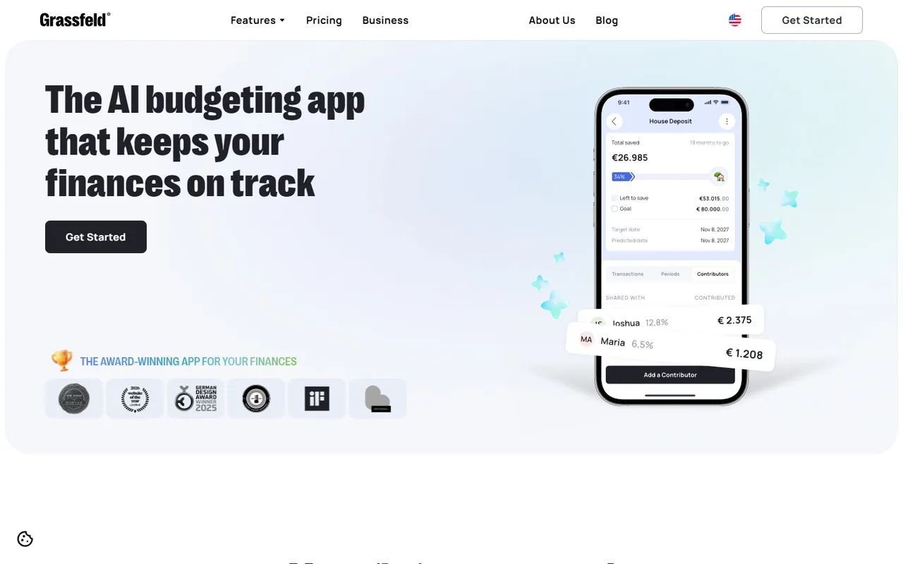
Rounded cards, 3D-style icons and pastel accents on a white and soft-blue base keep a money app feeling friendly. A phone mock-up with sample figures anchors the hero, with award badges and app-store buttons beside it.
The page is scroll-driven and mobile-first, with a language switch and a single Get Started button in the navigation.
An entry point for every module
Asset URLs point to Webflow's CDN, with images in AVIF and WebP, and the consent banner follows Google Consent Mode categories. The site runs in English and Dutch.
A feature menu in the header links each module, which gives every part of the product its own entry point.
Notable details
- Module-by-module product tour
- English and Dutch versions
- Phone mock-up hero
- Consent categories for analytics and ads